In web design, aesthetics play a pivotal role in capturing your audience’s attention and conveying the essence of your brand. While there are numerous elements that contribute to a visually appealing website, none is as influential as the strategic use of color. Welcome to our exploration of how you can harness the power of color theory in web design to elevate your Elementor website’s impact.
Color is more than just a visual component; it’s a powerful tool that can evoke emotions, convey messages, and shape user experiences. In the world of web design, where first impressions are often formed in a matter of seconds, the choice of colors can make or break your website’s success.
Elementor, the Best WordPress Website Builder, provides an excellent platform for implementing color theory in web design effectively. Whether you’re designing a personal blog, an e-commerce site, or a corporate webpage, understanding how to use color harmoniously can significantly enhance your website’s overall aesthetics and functionality.
In this blog, we’ll delve into the fundamentals of color theory, exploring concepts like color psychology, color harmony, and the impact of color on user behavior. We’ll also provide practical tips and techniques on seamlessly integrating these principles into your Elementor-based web design projects.
By the end of this blog, you’ll have a comprehensive understanding of how to wield the transformative power of color theory in web design to capture your audience’s attention and leave a lasting impact, ensuring that your Elementor website stands out in the vast digital landscape. Let’s embark on this colorful journey together and unlock the potential of your web design endeavors.
Fundamentals Of Color Theory In Web Design
Color is a powerful tool in the world of web design. It’s not just about aesthetics; it’s about communication, psychology, and user experience. Color theory in web design plays a pivotal role in guiding designers on how to use colors effectively to convey messages, elicit emotions, and create harmonious and engaging websites. In this comprehensive exploration, we will delve into the fundamentals of color theory in web design, touching upon concepts such as color psychology, color harmony, and the profound impact of color on user behavior.
The Basics Of Color Theory In Web Design:
At its core, color theory is a framework that helps designers make informed decisions about the use of colors in their projects. It’s a system that explores how colors interact with each other and with the human eye, both from a physiological and psychological perspective. Mastering color theory in web design is crucial for creating visually appealing, user-friendly, and effective websites.
The Color Wheel:
In color theory, the color wheel serves as the foundation. This wheel is a visual representation of colors organized in a circular format, showcasing the relationships between different colors. The primary colors, which are red, blue, and yellow, form the basis of the wheel. These primary colors cannot be created by mixing other colors. Secondary colors, such as green, orange, and purple, are formed by mixing two primary colors in equal parts. Tertiary colors are created by mixing a primary color with a secondary color, resulting in shades like red-orange or yellow-green.
Color Properties:
To comprehend color theory fully, it’s essential to understand the properties of color:
- Hue: Hue refers to the pure spectrum colors, such as red, blue, and green. It is what we typically think of when we talk about color.
- Saturation: Saturation, also known as chroma, describes the intensity or vividness of a color. Highly saturated colors are vibrant and bold, while low saturation results in muted or pastel tones.
- Value: Value is the brightness or darkness of a color. It is often described in terms of lightness or darkness, with white being the lightest and black being the darkest.
- Tone: Tone is a mixture of a color with gray, resulting in a more muted and less intense version of the original color.
Color Psychology:
The study of color psychology focuses on how colors affect human behavior, perception, and emotion. Different colors have the power to evoke specific feelings and associations, and understanding this aspect is critical in web design.
- Red: Red is a color associated with passion, excitement, and urgency. It can grab attention and stimulate the senses. In web design, it’s often used for buttons and calls to action to encourage users to take specific actions.
- Blue: The color blue provides a sense of calm and trustworthiness. It conveys professionalism, reliability, and tranquility. Many corporate websites use blue to establish credibility and build trust with their audience.
- Green: Green is linked to nature, growth, and harmony. It’s often used in websites related to sustainability, health, and the environment.
- Yellow: The color yellow symbolizes happiness, energy, and optimism. It can be used to draw attention and create a sense of cheerfulness in web design.
- Purple: Luxurious, creative, and sophisticated are often associated with purple color. It can be used in web design to convey a sense of elegance and uniqueness.
- Orange: Orange is a vibrant and energetic color that can convey enthusiasm and warmth. It’s often used in web design to create a sense of friendliness and approachability.
- Black: Black is a color of sophistication and power. It’s commonly used in luxury brands and high-end products to convey a sense of exclusivity and prestige.
- White: White represents purity, simplicity, and cleanliness. It’s often used in minimalist web design to create a sense of spaciousness and clarity.
- Gray: Gray is a neutral color that can convey balance and professionalism. It’s often used as a background color in web design to create a sense of neutrality and contrast with other elements.
- Brown: There is a sense of earthiness and reliability associated with brown color. It’s often used in web design for businesses related to outdoor activities, food, or craftsmanship.
Understanding the emotional impact of colors can help designers choose the right color schemes to elicit the desired user response. For example, a website selling energy drinks might use vibrant reds and yellows to convey excitement and energy, while a meditation app would opt for calming blues and greens to create a sense of relaxation and peace.
Color Harmony:
Creating visually pleasing and harmonious color combinations is a fundamental aspect of web design. Color harmony refers to the arrangement of colors in a way that is aesthetically pleasing and balanced. Several color harmony models exist to help designers achieve this balance:
- Complementary Colors: Complementary colors are pairs of colors that are directly opposite each other on the color wheel, such as red and green or blue and orange. Using complementary colors can create strong visual contrast and make elements stand out. However, they should be used sparingly to avoid overwhelming the viewer.
- Analogous Colors: Analogous colors are colors that are next to each other on the color wheel, such as blue, green, and yellow. These color schemes create a sense of harmony and are often used in designs where a subtle and unified color palette is desired.
- Triadic Colors: Triadic color schemes involve selecting three evenly spaced colors on the color wheel, creating a triangle. This approach provides a balance between contrast and harmony, making it suitable for diverse and lively designs.
- Split Complementary Colors: Split complementary color schemes are variations of complementary colors. Instead of using the direct complement of a color, one chooses the two colors adjacent to its complement. This approach provides a balance between contrast and harmony.
- Monochromatic Colors: Monochromatic color schemes involve using variations of a single color by adjusting its saturation and value. This creates a harmonious and minimalist look, often used in modern and elegant web design.
Achieving color harmony in web design not only enhances the visual appeal but also contributes to a better user experience. A harmonious color palette creates a sense of coherence and professionalism, making it easier for users to navigate and engage with a website.
The Impact Of Color On User Behavior:
Colors have a profound impact on user behavior when interacting with websites. Designers can strategically leverage color to influence users’ actions, decisions, and emotions. Here are some ways in which color can influence user behavior:
- Attention and Click-through Rates: Vibrant and contrasting colors can draw attention to specific elements on a web page, such as buttons, links, or CTA buttons. Using colors like red or orange for CTAs can increase click-through rates and encourage users to take desired actions.
- Readability and Legibility: The choice of text and background colors significantly affects readability. High-contrast color combinations, such as black text on a white background, enhance legibility, ensuring that users can easily consume content.
- Trust and Credibility: Colors like blue and green are often associated with trustworthiness and credibility. Websites that use these colors in their design may appear more reliable to users.
- Emotional Engagement: Colors can evoke specific emotions. Warm colors like red and orange can create a sense of urgency or excitement, while cool colors like blue and green can convey calmness and trust. Depending on the website’s goals, designers can use color to elicit specific emotional responses from users.
- Brand Recognition: Consistent use of color in branding helps users recognize and remember a website or company. For example, the red and white color scheme is closely associated with Coca-Cola, making it instantly recognizable.
- Navigation and Hierarchy: Color can be used to establish a visual hierarchy on a web page. Important elements can be highlighted with contrasting colors, guiding users’ attention and making it easier for them to navigate the site.
- Seasonal and Cultural Significance: Different cultures associate colors with specific meanings and traditions. Understanding cultural color symbolism is essential for websites with a global audience to avoid unintentional misunderstandings or offense.
- Aesthetic Appeal: Ultimately, the overall aesthetics of a website play a significant role in user behavior. A visually pleasing color scheme can encourage users to spend more time on a site, explore its content, and return for future visits.
Best Practices For Using Colors In Web Design:
To harness the power of color effectively in web design, designers should adhere to best practices:
- Consider the Target Audience: Understanding the preferences and expectations of the target audience is crucial. Different age groups, genders, and cultures may respond differently to color choices.
- Maintain Contrast: Ensure that text and background colors have sufficient contrast to ensure readability. Use tools and guidelines, such as the Web Content Accessibility Guidelines (WCAG), to create accessible color combinations.
- Limit the Color Palette: Avoid overwhelming users with too many colors. Stick to a limited color palette to create a cohesive and unified design. Typically, a palette with two or three main colors and a few accent colors is sufficient.
- Test for Color Blindness: Consider users with color vision deficiencies, such as red-green color blindness. Test your design to ensure that information is distinguishable even for these users.
- Use Color Consistently: Maintain consistency in color use across the website. Ensure that similar elements, such as buttons or headings, have consistent colors throughout the site.
- Test with Real Users: Conduct user testing to gather feedback on the color choices and their impact on user behavior. This can help identify any usability issues related to color.
- Consider Branding: If the website represents a brand, align the color scheme with the brand’s identity and values. Consistency between online and offline branding materials is essential for brand recognition.
- Keep Mobile Responsiveness in Mind: Colors may appear differently on different devices and screens. Test your color choices on various devices to ensure a consistent and appealing appearance.
- Use Color as a Secondary Tool: While color is a powerful design element, it should not be the sole means of conveying information. Always provide alternative ways, such as text or icons, to communicate important messages.
- Stay Updated: Stay informed about design trends and evolving color preferences. What is considered appealing and effective in web design can change over time.
Case Studies:
To better understand the practical application of color theory in web design, let’s explore a couple of case studies.
Case Study 1: Facebook
Facebook, the world’s largest social media platform, uses a distinctive blue color scheme in its design. The choice of blue is not accidental; it aligns with the platform’s goals and values.
- Color Choice: Facebook’s use of blue conveys trust, reliability, and professionalism. It fosters a sense of security, encouraging users to share personal information and connect with others.
- Contrast and Readability: The blue background provides high contrast with white text, ensuring that content and messages are easily readable. This enhances the overall user experience.
- Branding: Facebook’s blue logo and color scheme have become iconic, making it instantly recognizable. The consistent use of blue across its platform and branding materials reinforces its identity.
- Emotional Engagement: While blue is often associated with calmness, Facebook aims to create a positive and enjoyable experience. The platform achieves this by using various shades of blue and complementing them with warm accent colors, such as notifications in red.
- Navigation: The blue color is strategically used for important elements, such as the Facebook logo and primary navigation bar, making them easily identifiable and accessible.
Case Study 2: Airbnb
Airbnb, an online marketplace for lodging and travel experiences, employs a unique color palette that reflects its brand identity and user-centered approach.
- Color Choice: Airbnb uses a combination of colors, including a warm red, teal, and gray. The red symbolizes energy and excitement, while teal evokes a sense of trust and adventure. These colors align with the platform’s mission of providing unique and memorable travel experiences.
- Contrast and Readability: The contrasting red and teal colors are used sparingly for buttons and calls to action, making them stand out. This encourages users to take actions like booking accommodations or exploring listings.
- Emotional Engagement: Airbnb’s color palette is carefully curated to convey a sense of wanderlust and exploration. The combination of warm and cool colors creates a balance between excitement and relaxation, catering to the diverse emotions associated with travel.
- User-Centered Design: Airbnb’s design choices prioritize user experience. The use of high-contrast text ensures that information is easily accessible, and the color palette enhances the overall aesthetics of the platform.
- Cultural Considerations: Airbnb’s platform caters to a global audience, and its design takes cultural considerations into account. The use of diverse and inclusive imagery and colors reflects the platform’s commitment to diversity and cultural sensitivity.
In both case studies, color plays a pivotal role in shaping the user experience and reinforcing the brand identity. Facebook’s use of blue emphasizes trust and reliability, while Airbnb’s combination of red and teal creates a sense of excitement and adventure. These examples demonstrate how color theory principles are applied in real-world web design to achieve specific goals and resonate with users.
How To Implement Color Theory In Web Design With Elementor:
Implementing color theory in web design using the Elementor page builder with global colors is a great way to ensure consistency and efficiency in your design process. Elementor allows you to define and use global colors across your entire website, making it easy to maintain a harmonious color scheme and update colors universally when needed. Here’s a step-by-step guide on how to implement color theory in web design with Elementor’s global colors:
1. Set Up Your Color Palette
Before diving into Elementor, it’s essential to establish a color palette based on color theory principles and your project’s objectives. Determine your primary, secondary, and accent colors, ensuring they align with your brand and the emotions you want to convey.
2. Access Elementor and Create a New Page
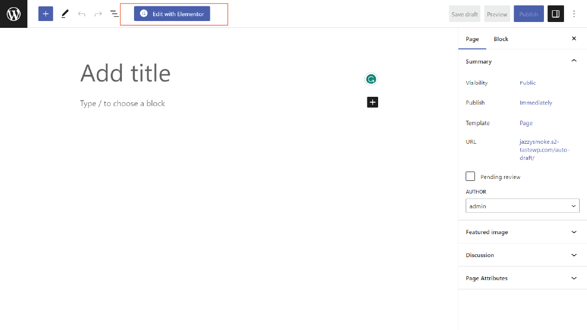
Log in to your WordPress dashboard, go to the page you want to design, and click the “Edit with Elementor” button to launch the Elementor editor.

3. Access Elementor and Create a New Page
Elementor introduced a global colors feature that allows you to define and use colors consistently throughout your website. Here’s how to define global colors:
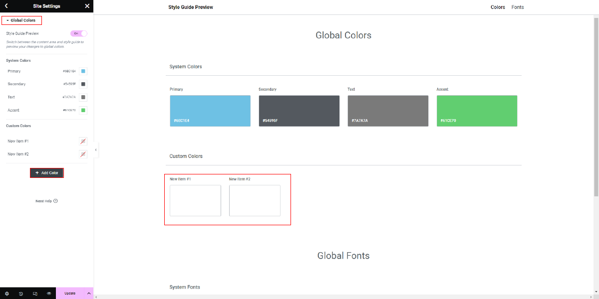
In the Elementor editor, click on the Menu (3 lines) at the top left corner of the screen. Then Click on Site Setting.

- Navigate to the “Global Colors” tab in the settings panel.
- Click on the “+ Add Color” button to create a new global color.
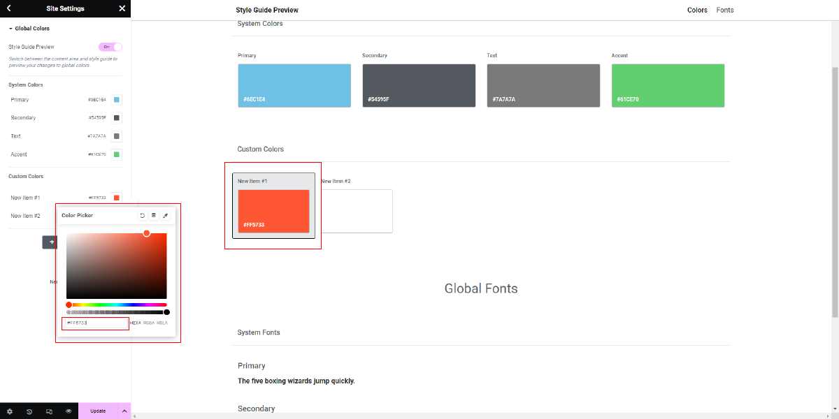
- Enter a name for the color, and then choose or input the color using various methods:

- Color Picker: Click on the color box and use the color picker to select a color.
- Hex Code: Input the hexadecimal color code (e.g., #FF5733).
- RGB: Input the RGB values for the color.
- Adjust the color’s opacity if necessary.
- Once you’ve defined the global color, click the “Add Color” button to save it.
- Repeat this process for all the colors in your palette, defining them as global colors.

4. Apply global colors to Elements

Now that you have defined global colors, you can apply them to various elements on your web page:
- Select an element on your page within the Elementor editor.
- In the element’s style settings, such as text color, background color, border color, or any other color-related setting, you’ll see a color picker.
- Click on the color picker to open it, and you’ll notice a section labeled “Global” with your defined global colors.
- Click on the global color you want to use, and it will be applied to the selected element.
- You can change the color of multiple elements simultaneously by applying the same global color.
5. Maintain Consistency
One of the key advantages of using global colors in Elementor is the ability to maintain consistency throughout your website. If you ever need to update a color, you can do so in one place, and it will automatically be reflected across all instances where that global color is used.
- To update a global color, go back to the “Global Colors” settings panel.
- Find the color you want to update, click on it, and modify the color or opacity as needed.
- Save the changes, and Elementor will apply the updated color universally.
6. Create Color Schemes
With your global colors in place, you can now create color schemes for different sections or pages of your website. Utilize the principles of color theory in web design to establish harmonious combinations of your global colors.
- Apply your color scheme to various elements on the page, such as headings, buttons, backgrounds, and text.
7. Test and Iterate
After applying your color scheme, it’s crucial to test your design for usability and visual appeal. Solicit feedback from users or colleagues to ensure that the color choices effectively convey your intended message and emotions.
8. Save and Publish
Once you are satisfied with the implementation of color theory in web design using Elementor’s global colors, click the “Save” button and then “Publish” to make your changes live on your website.
9. Monitor and Update
Web design is an ongoing process. Continuously monitor user behavior and feedback to determine if any adjustments to your color choices are necessary. Elementor’s global colors make it easy to update colors across your site as needed.
By following these steps and leveraging Elementor’s global colors feature, you can effectively implement color theory in web design, create visually appealing and harmonious websites, and maintain consistency across your entire site.
Conclusion
In conclusion, harnessing the power of color theory in web design is not merely about choosing pretty shades; it’s about crafting a digital experience that resonates, communicates, and engages. We’ve explored the fundamentals, from the color wheel to the psychology behind hues, delving into the impact colors have on user behavior. By studying best practices and real-world case studies like Facebook and Airbnb, we’ve witnessed how color choices can define brands and user interactions.
Furthermore, we’ve learned how to implement color theory in web design effectively using tools like Elementor, emphasizing the importance of global colors for consistency and efficiency within WordPress Elementor themes. With this knowledge, you’re well-equipped to elevate your website’s impact, creating designs that not only look stunning but also leave a lasting impression on your audience. Remember, color isn’t just a visual element; it’s a powerful language waiting to be spoken through your web design with the help of WordPress Elementor themes.
The WordPress theme bundle, paired with premium Elementor themes, leverages color theory in web design. Meticulously curated palettes enhance user experience, guiding emotions and actions. This combination empowers designers to create visually captivating and effective websites, seamlessly blending aesthetics with functionality.


